Qualitative and Quantitative consumer research | Brand positioning | Brand narrative | Brand identity| Launch Communication | Guideline | Strategic Consulting (ongoing)
When Elevate X’s co-founder, Siddhant and Shivani Anand approached us to co-create a new furniture brand that marries superior aesthetics with competitive pricing through an integrated omni-channel platform we dived headfirst into the opportunity. From a business idea that centres around making designer furniture accessible we created a brand world that aligns with the modern meaning of luxury and reimagines retail experience in a unique way
Our objective was two fold;
to ensure strong memorability for the new brand through a consistent narrative and visual language to differentiate the brand from the current key players in the category
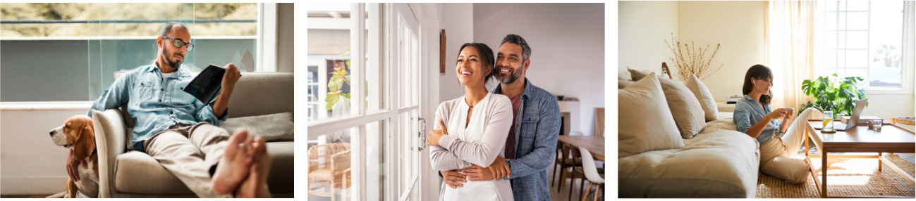
Through our secondary and primary qualitative consumer research, we identified that the importance of a home had shifted drastically in a post-covid environment. The growth of #cottagecore and a reverse migration statistics telling us a shift in the urban mindset seeking comfort in the “the slow life”.
Our research also saw an emergence of conscientious luxury among the targeted consumer segment, seeking a value-system alignment with brands, investing time and personal taste incurating their personal spaces while demanding luxury that prioritises experience and comfort.
Why : A brand that inspires contemporary soulful experiences and encourages “slow living”
How: Thoughtfully designed by global designers, curated for your unique taste by home stylist & an integrated retail experience designed to slower your home buying experience
What : A multichannel furniture brand with aesthetics that will bring you closer to yourself, reflect your unique taste and inspire you to spend time with yourself.
Golden circle by Simon Sinek
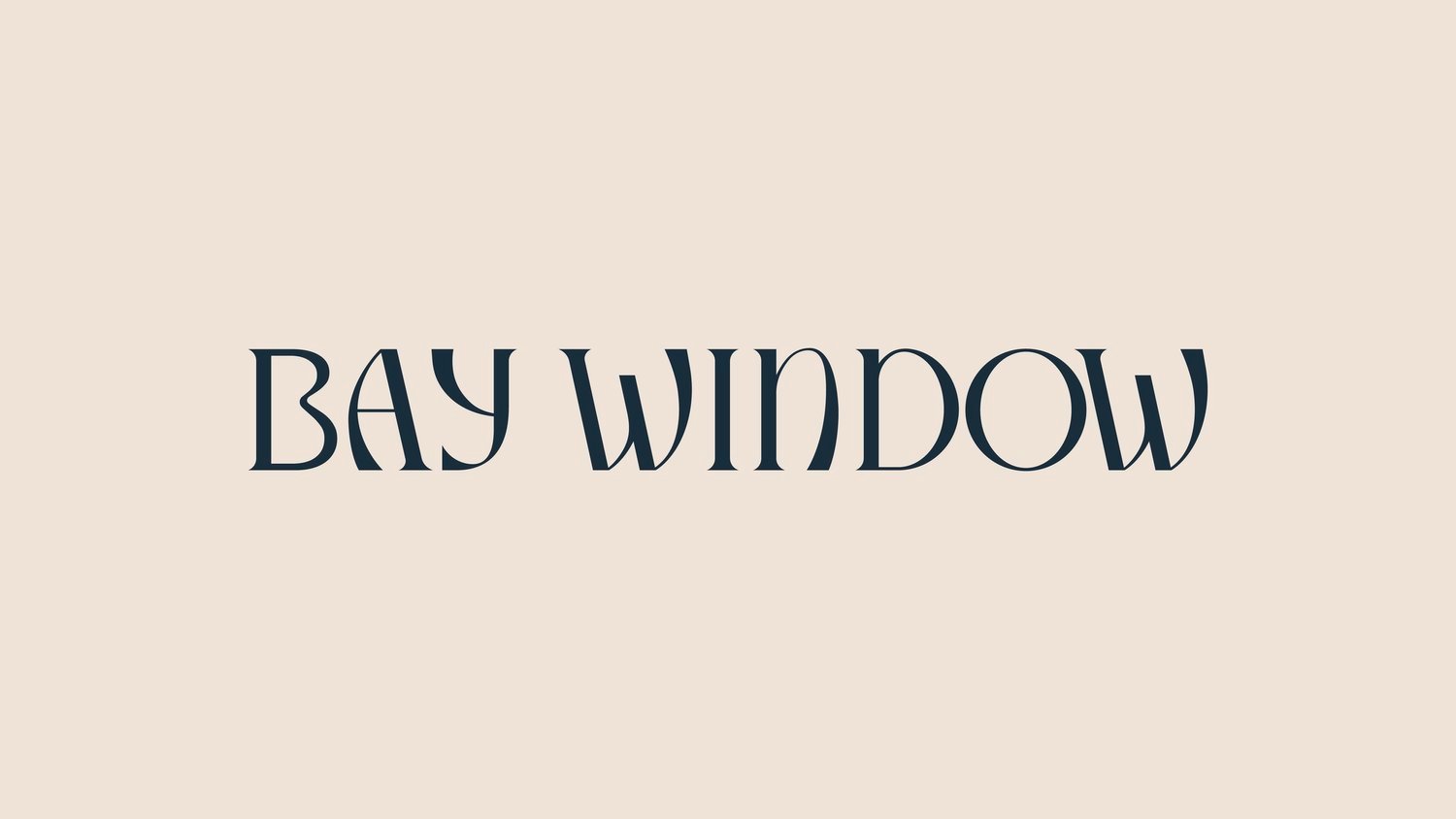
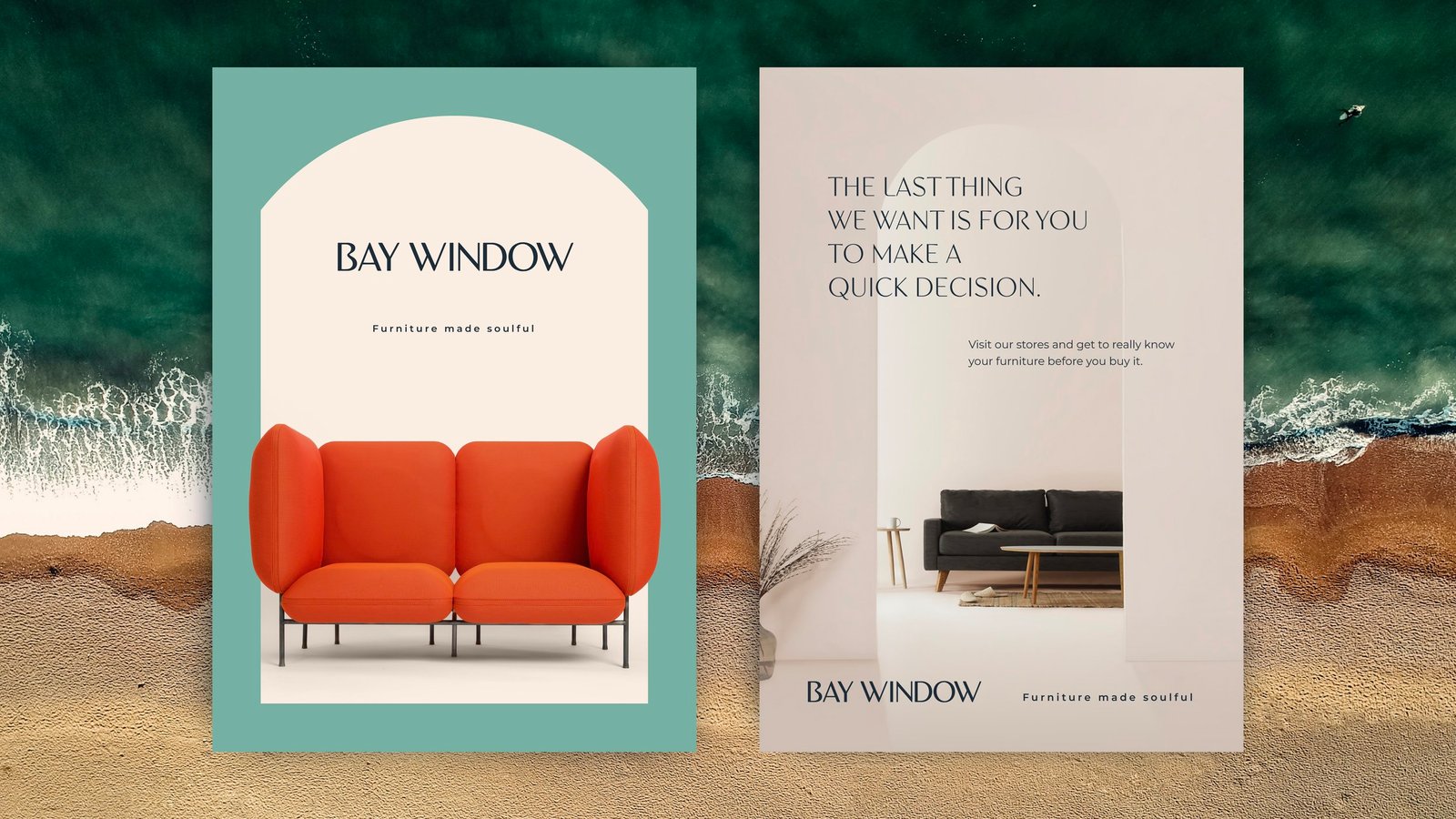
The brand name is inspired by that “soulful space” at home where we spend time with ourselves, capturing that moment when the eyes blink as rays of sunlight peep through the leaves
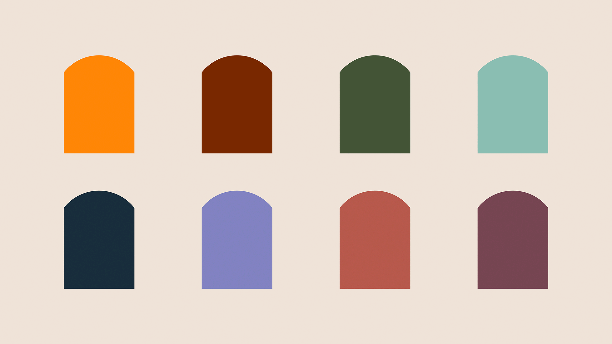
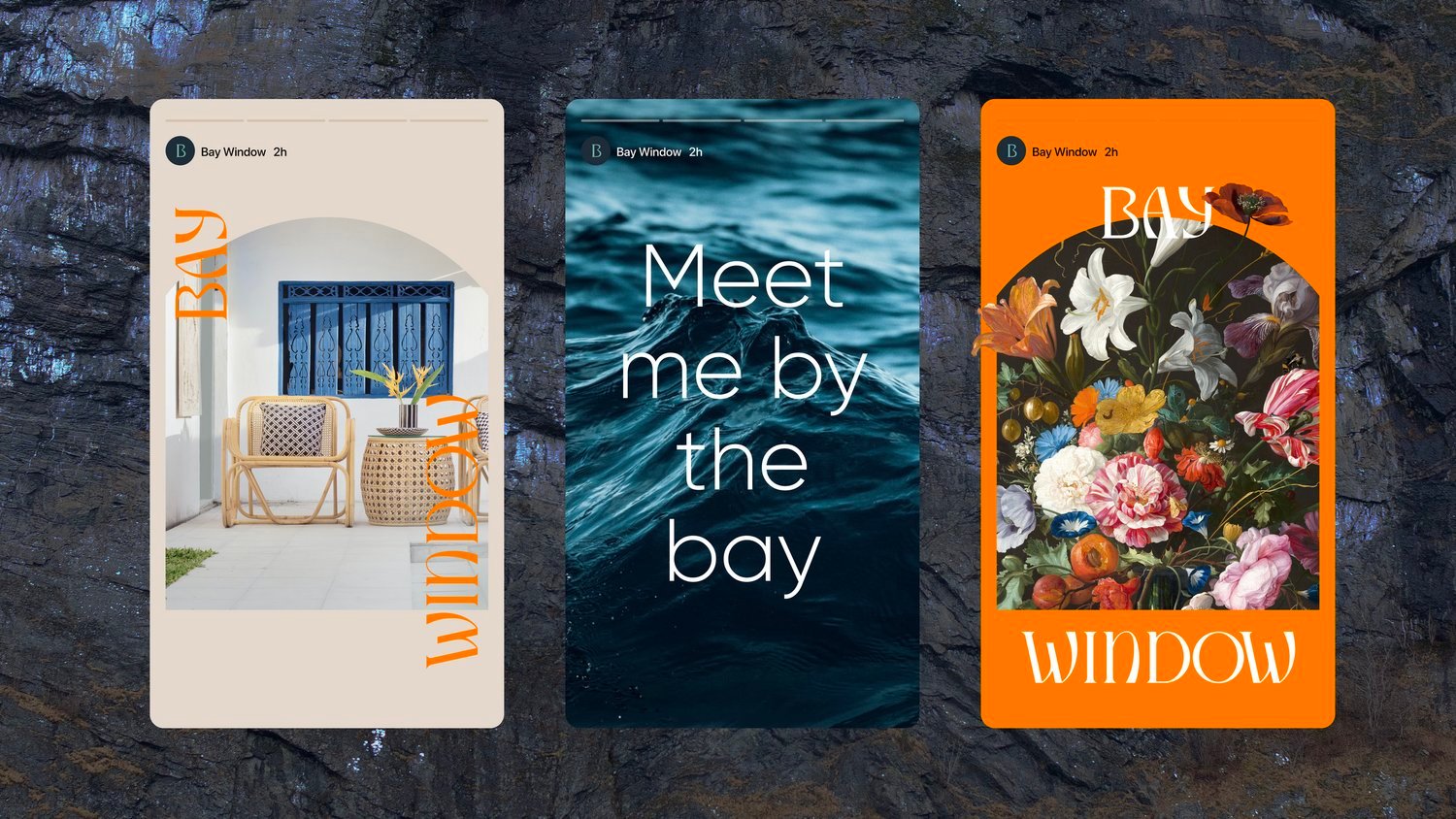
The brand identity wordmark is inspired by both the architecture of the building and nature. Similarly, the “cartouche” shape is an ownable consistent visual element to create a recall, inform the brand’s shape language, with frame imagery, patterns, and text across digital and physical spaces.